Dreamstore at Dreamforce 2026
The Dreamstore is a pop-up retail experience at Dreamforce — a curated merchandise store open to all attendees and Salesforce employees. It exists to turn event energy into tangible joy: playful, inclusive, and unmistakably Salesforce. The Dreamstore is a happiness machine. Every purchase is also an act of giving, with a portion of proceeds supporting charitable causes. The Dreamstore serves three roles at once — revenue-generating channel, brand expression moment, and charitable giving touchpoint.
Senior Art Director
Salesforce + GPJ
2026
Environmental Graphics
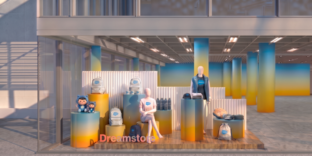
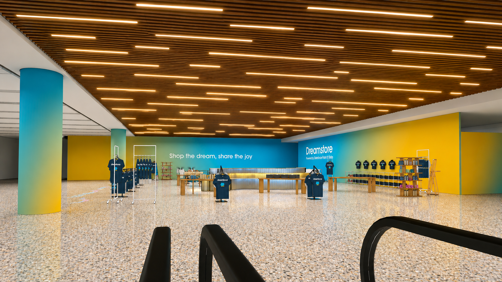
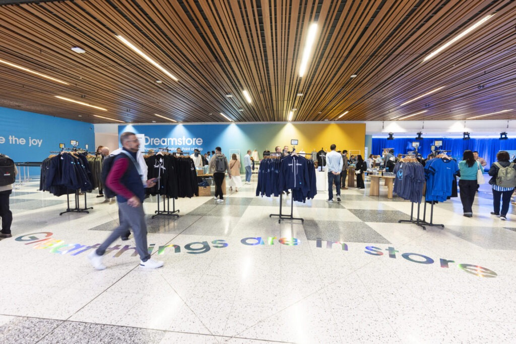
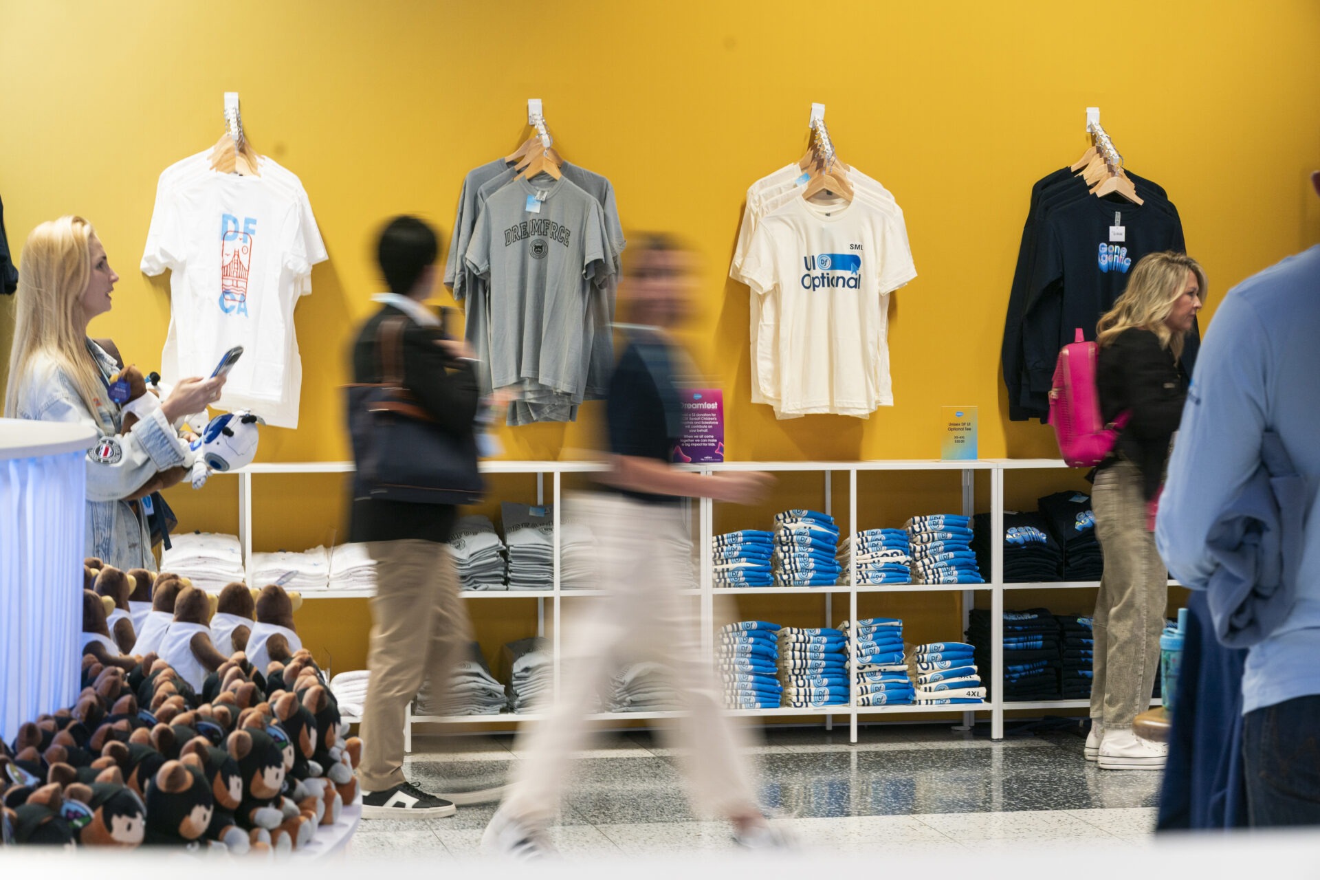
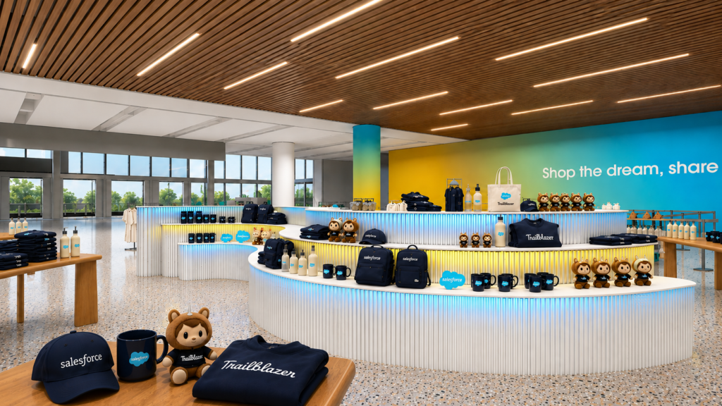
For the Dreamstore this year, the environmental graphics leaned into the idea of a gradient drench – a single, sweeping color wash across the walls and surfaces rather than pattern-driven or element-heavy design. It’s a deliberate counterbalance to the rest of Dreamforce campus, where most spaces pull more heavily from the broader design system’s motifs and graphic elements. This gives the Dreamstore its own distinct, quieter visual identity and helps it read as a clear destination rather than more of the same.
That restraint is also practical since the Dreamstore is, by nature, full of merchandise, and merchandise creates its own visual noise. A busy, element-heavy backdrop on top of that would tip the space into overwhelming. The gradient drench gives all that merchandise a clean, calm stage to sit against, letting the product be the focal point instead of competing with the walls around it.
Footprint
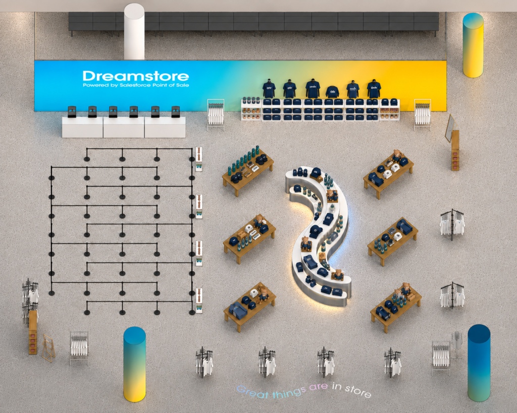
The retail space’s footprint was designed around ease of access and flow. Multiple entry points let shoppers approach the store from different directions rather than funneling everyone through a single door, while the checkout line was given ample dedicated room. By placing it towards the rear of the store, the queuing never eats into the product space or shopping experience itself.
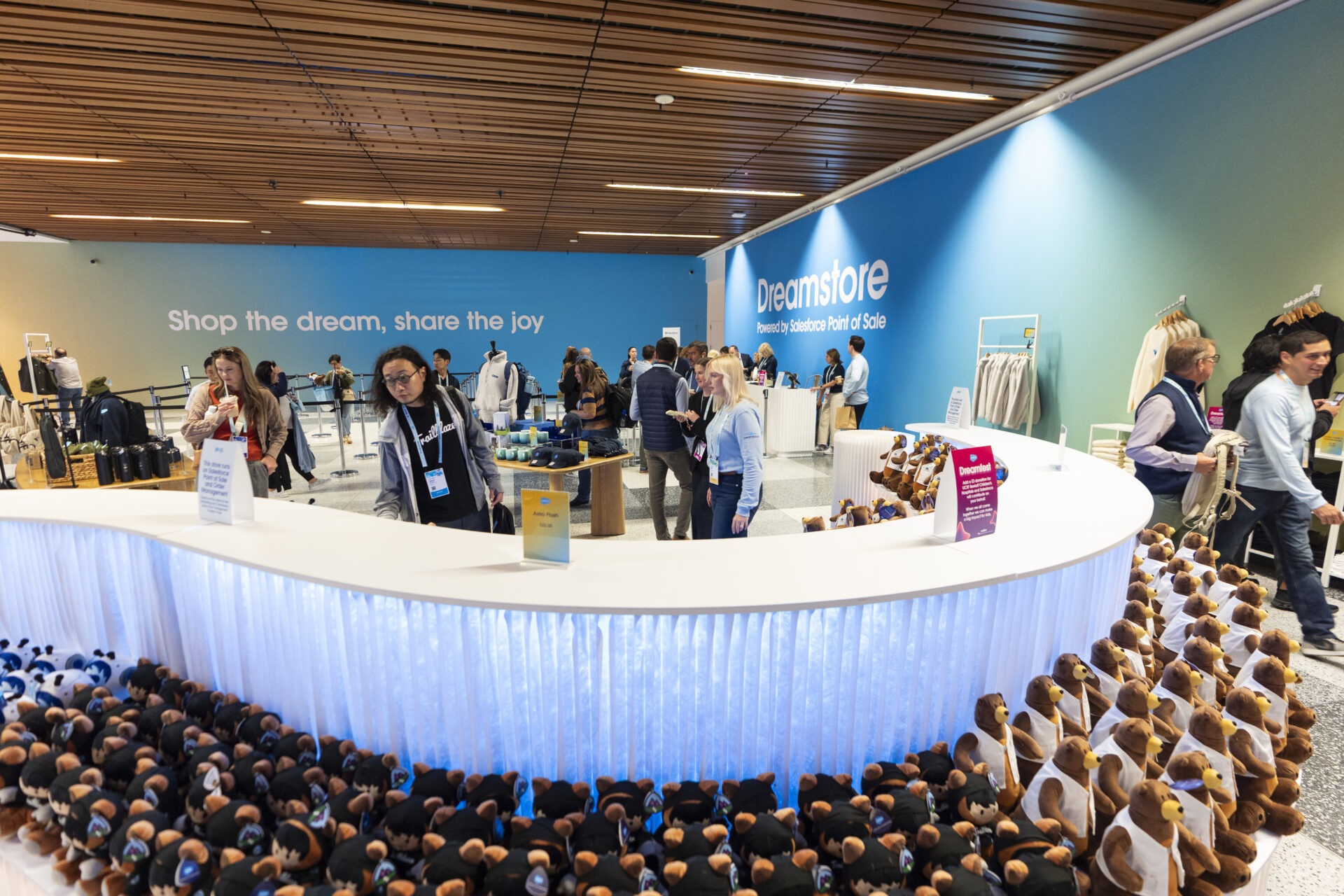
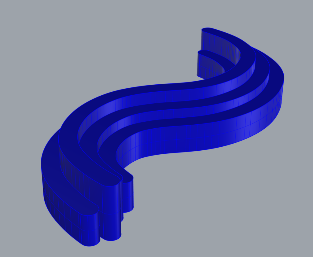
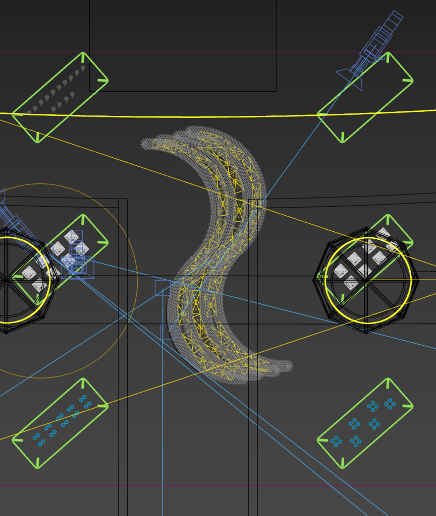
The centerpiece of the layout is an s-curved, tiered Molo wall with under-counter lighting in blue and yellow to echo the gradient graphics elsewhere in the space. Beyond its visual impact, the piece does double duty. Its undulating form and material mirror the same 3D patterns found throughout the Dreamforce design system. So the space picks up that design language physically and dimensionally rather than relying purely on graphics to carry it through. And, positioned centrally, the wall also acts as a natural focal point. Its curved form and illumination is visible from multiple vantage points, drawing prospective shoppers in from across the floor.
Window Display
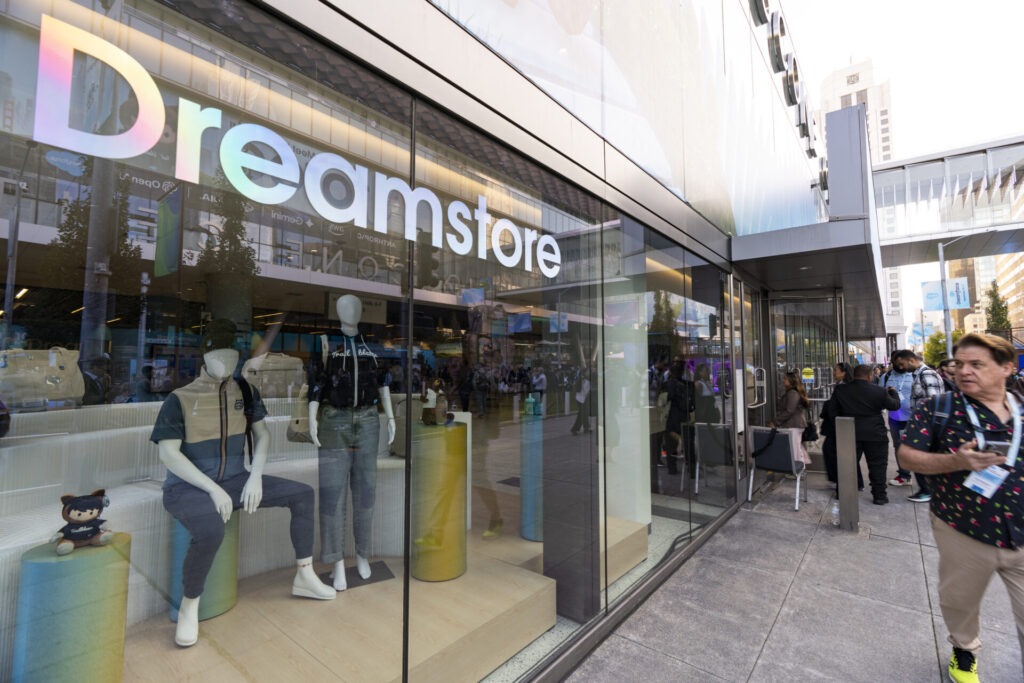
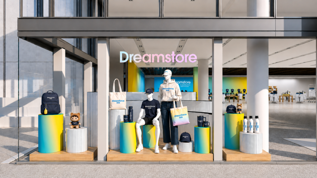
The window display extends the retail space’s identity out to Howard street, by using the same design vocabulary found inside. A curving Molo wall backdrop and gradient vinyl-wrapped pedestals echo the store’s interior finishes, so attendees get a preview of the space before they even walk in. Mannequins are placed centrally to stay the most prominent element in the composition, arranged in fairly neutral poses so they draw the eye without pulling too much attention away from the rest of the display.
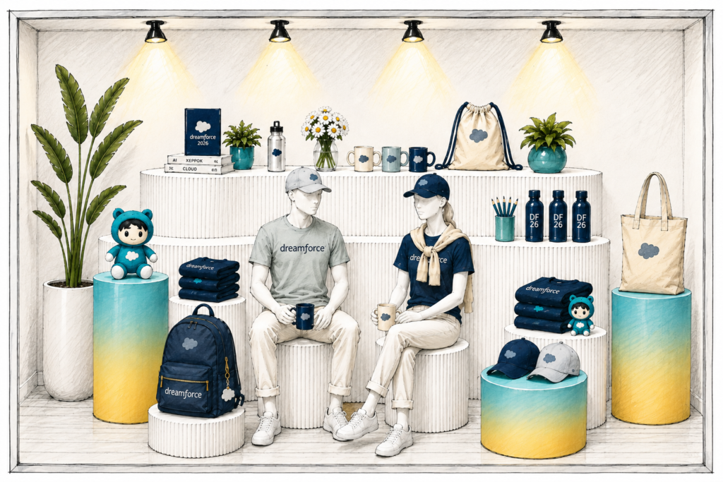
Lastly, the window itself carries a vinyl graphic of the store name in an iridescent color and material. It’s another subtle, but important nod back to the material foundations of the Dreamforce visual identity that helps tie the store into the rest of the campus experience. Below you can see earlier iterations of this concept and how we ultimately landed on the final version by focusing on a clear sightline to the store inside.